
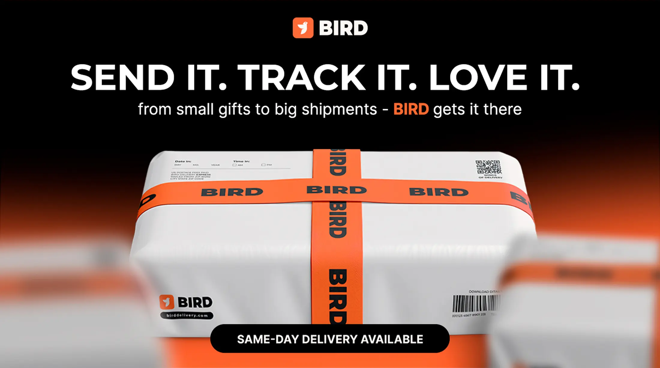
Fast, human-first delivery — built for real life.
Bird
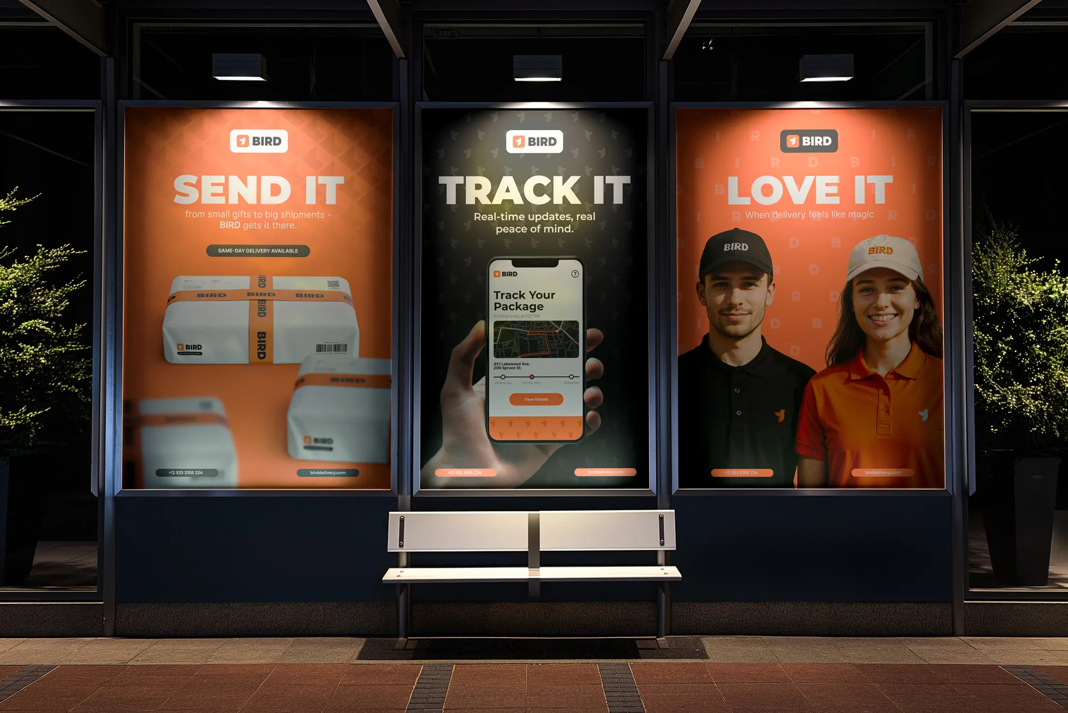
Send it.
Track it.
Love it.
BIRD is a modern delivery service built for speed, clarity and simplicity. We created an identity that makes a functional service feel immediate, approachable and human.
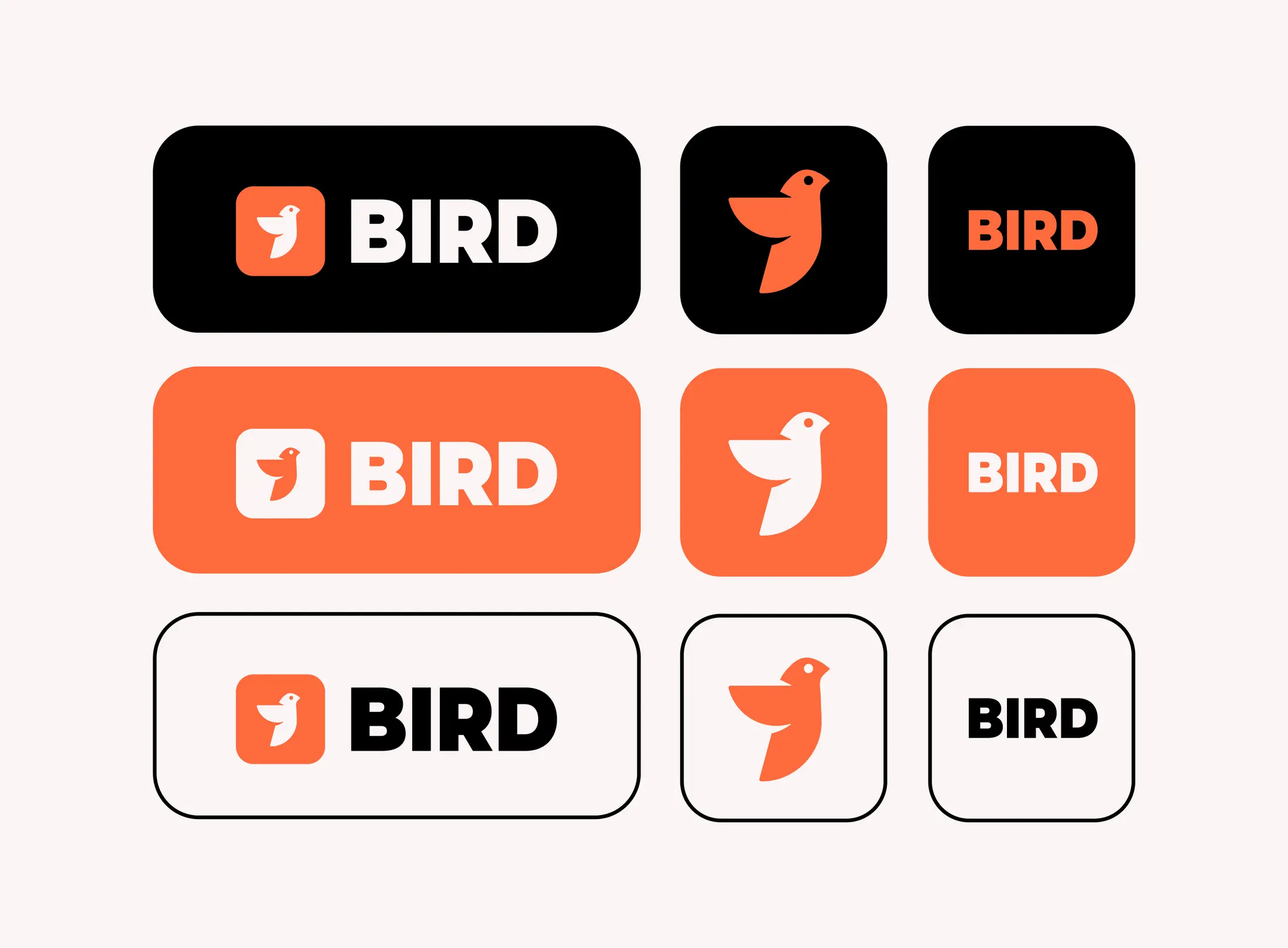
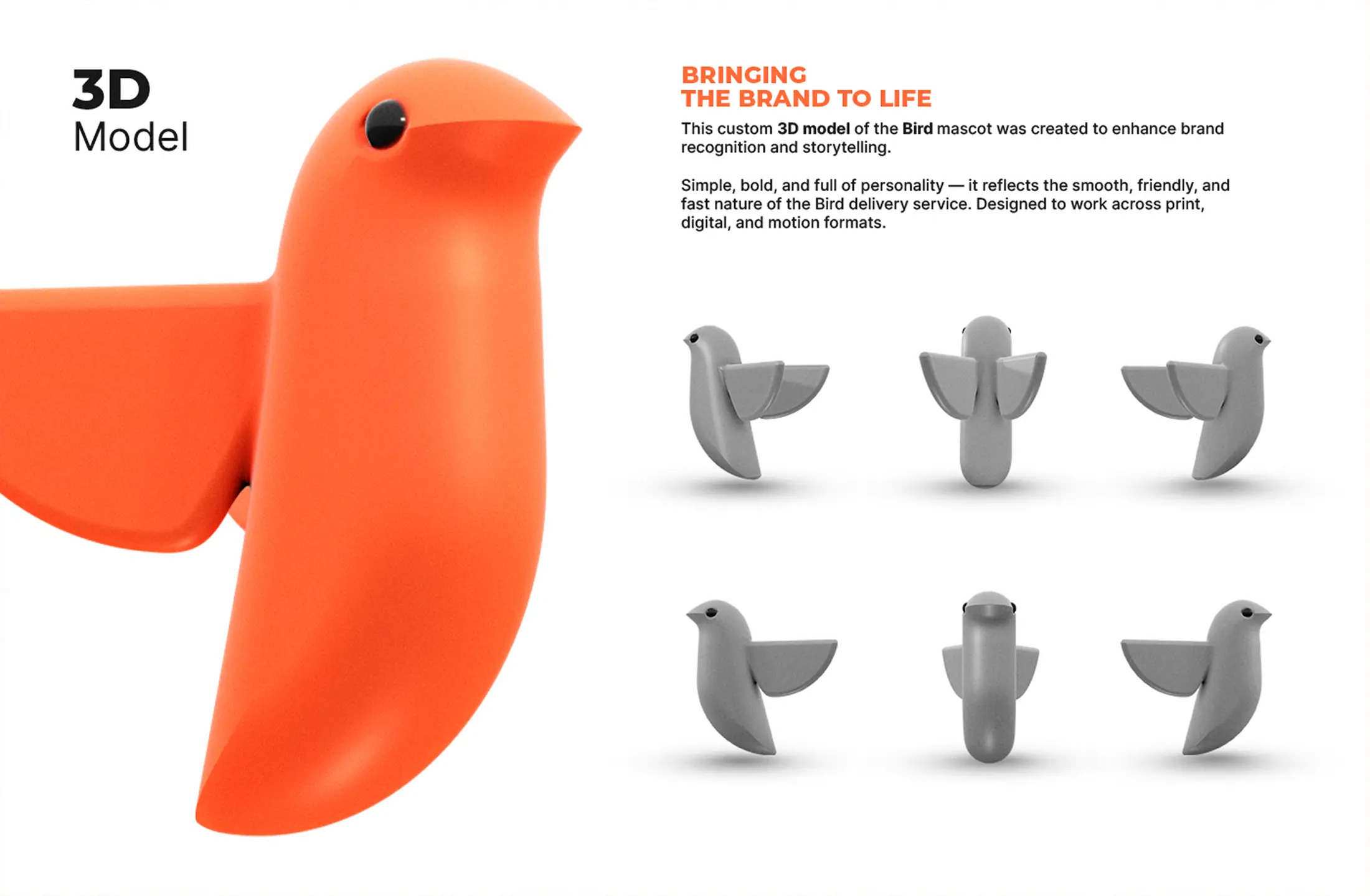
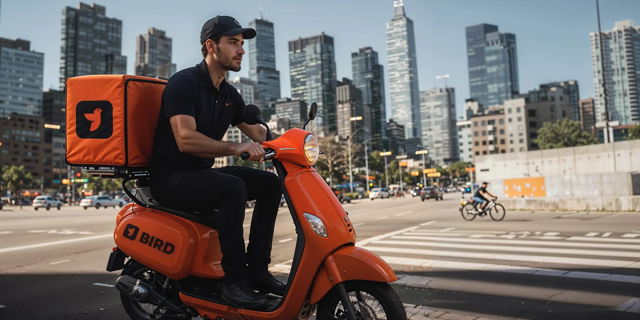
The result is a flexible system that stays recognizable from a tiny app icon to packaging, uniforms, vehicles and city-scale media.
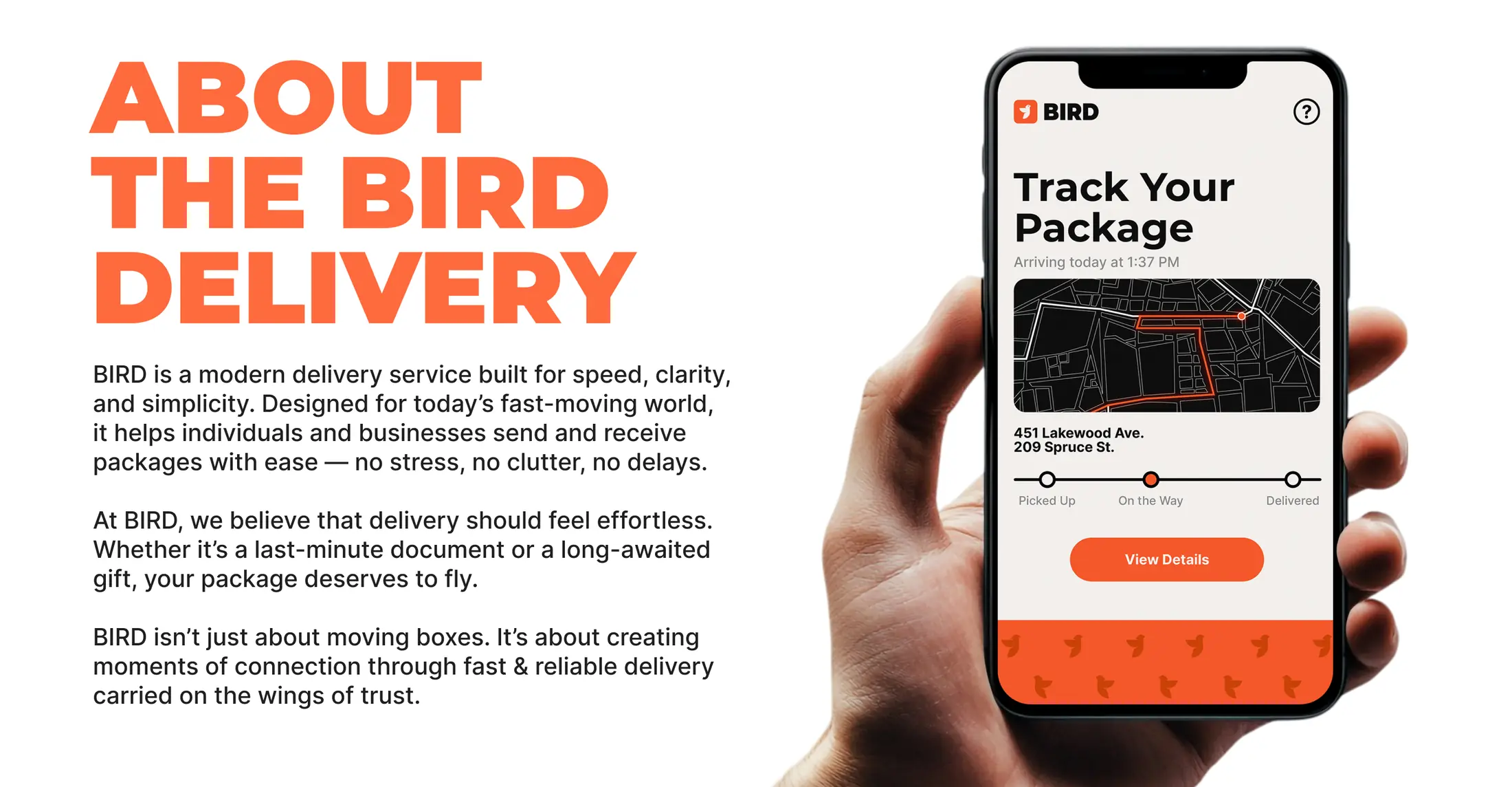
Fast. Clear.
Human.
The brand is organized around one promise: remove friction from everyday delivery without losing the feeling of personal care.
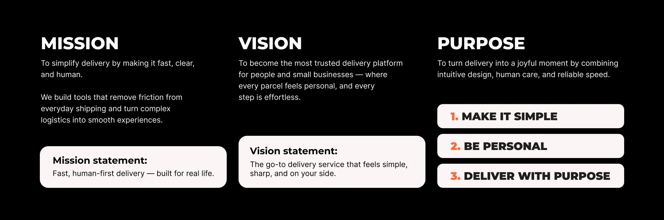
A mark built
to move.
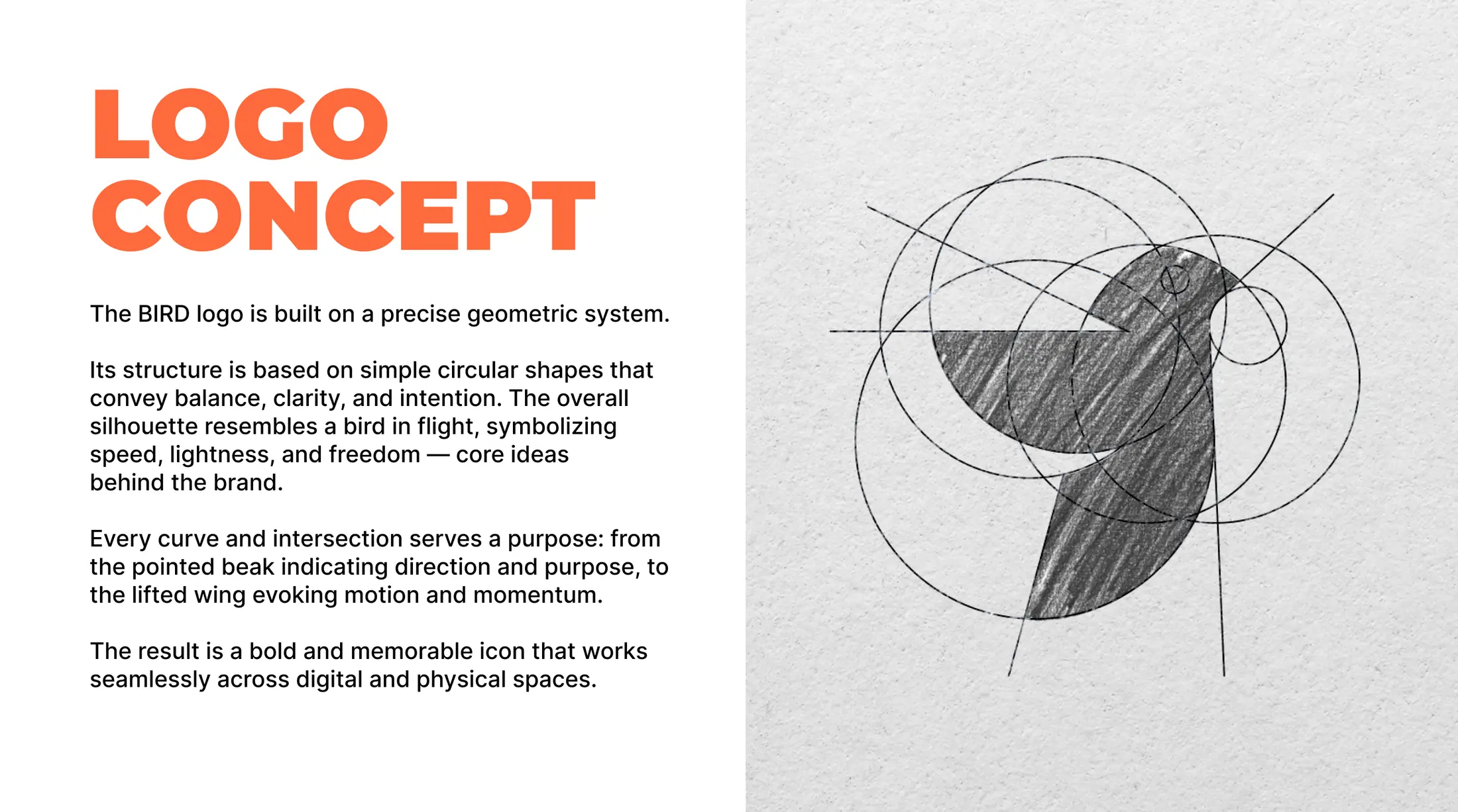
Precise circular geometry creates a bird in flight. The beak points forward, the lifted wing signals movement, and the compact silhouette stays clear at every scale.

Bold enough
to move.
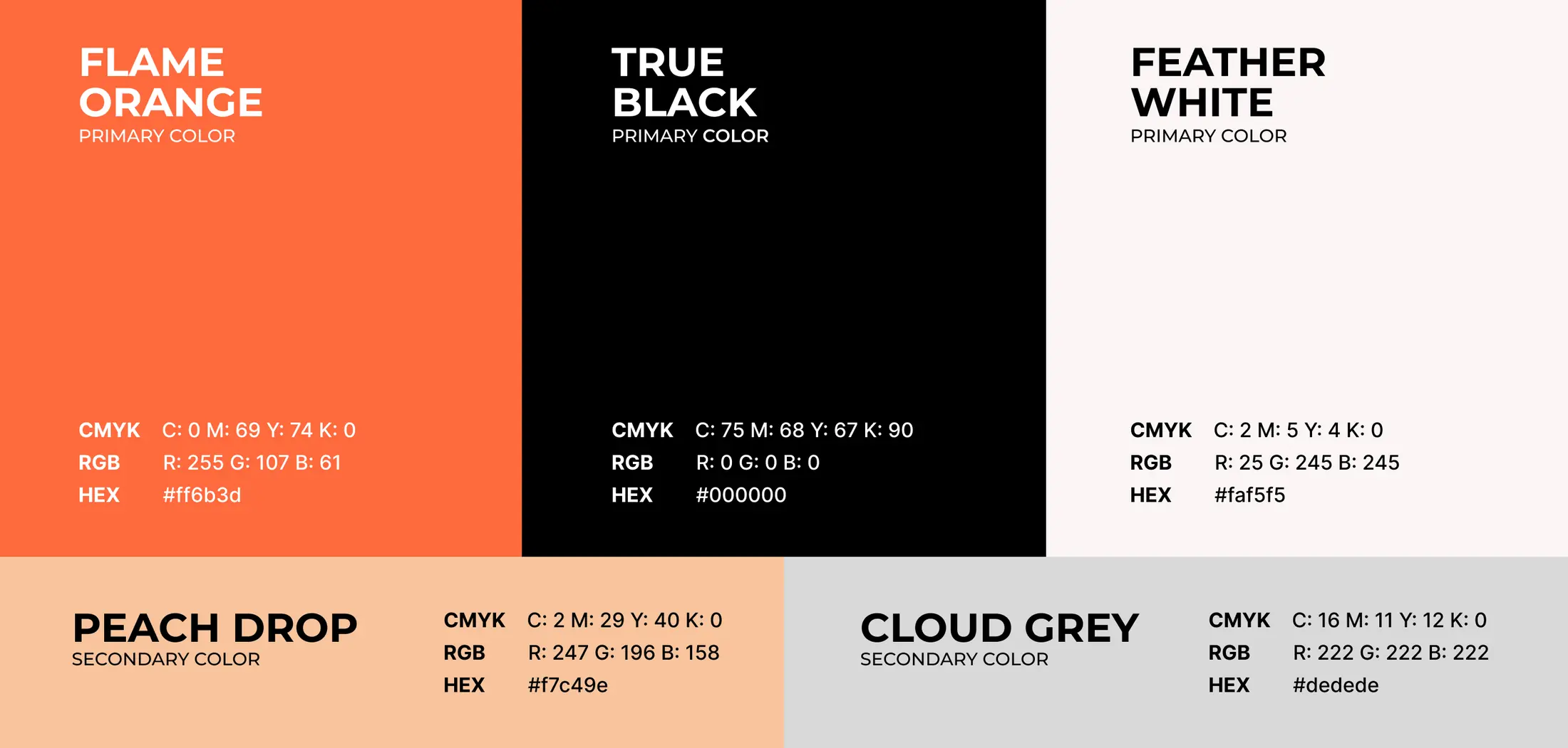
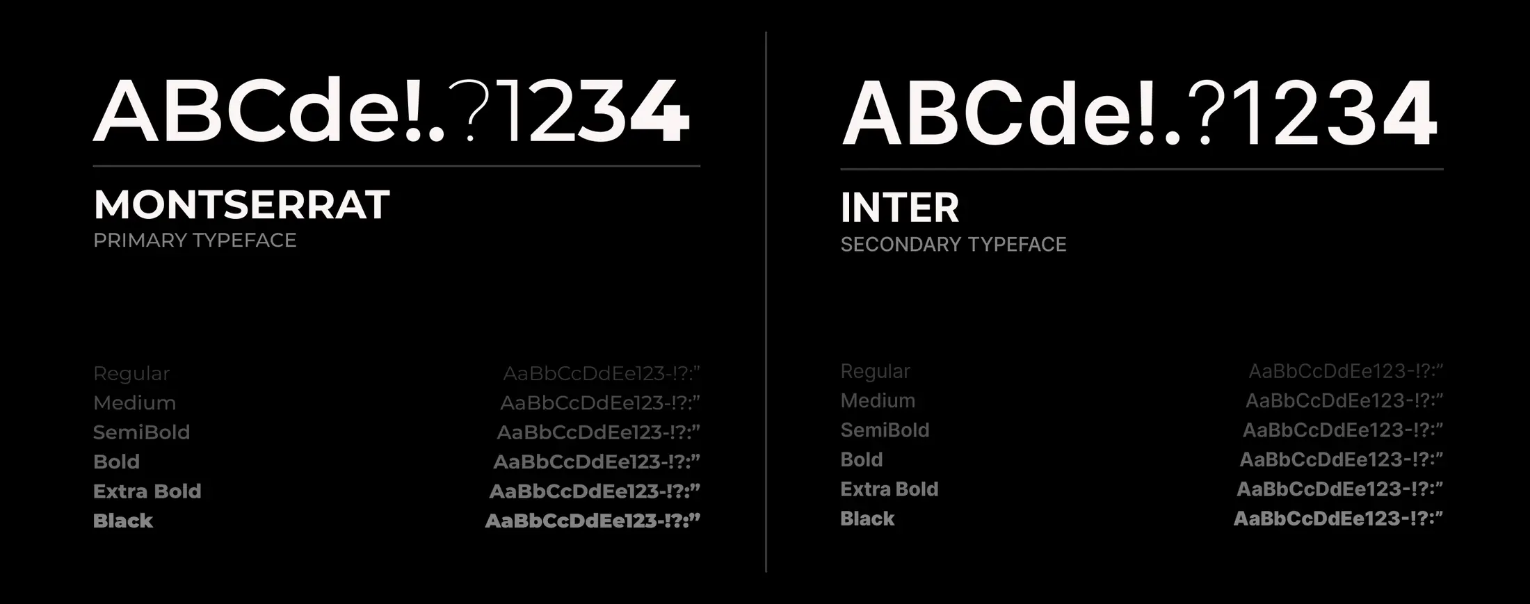
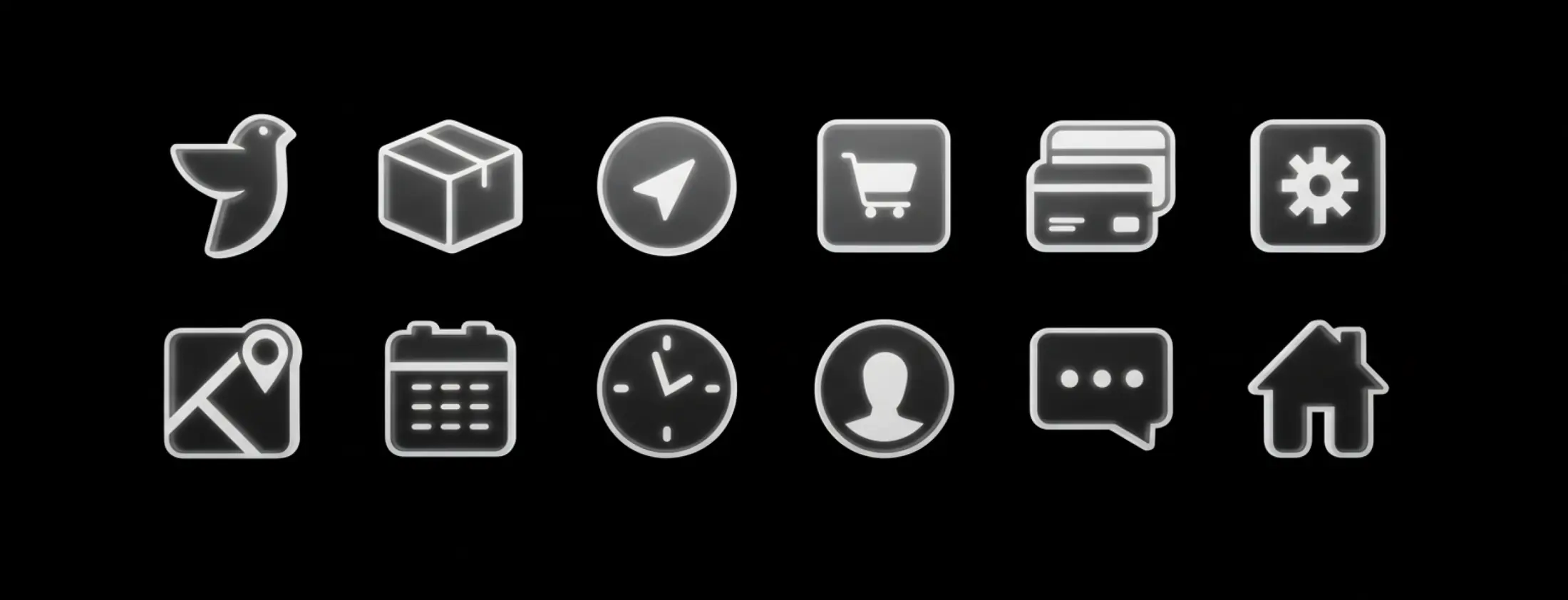
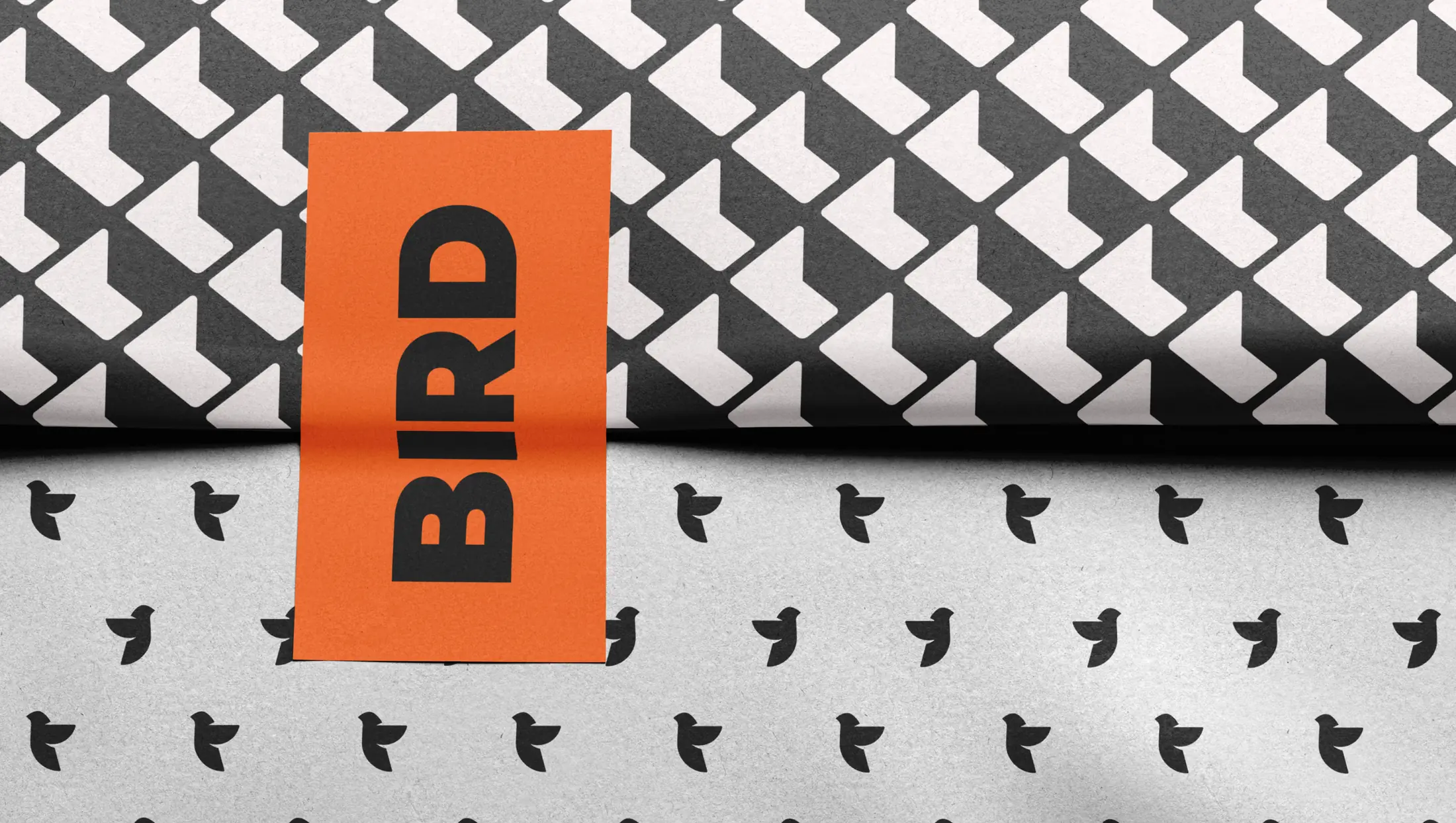
Flame orange creates instant recognition. A disciplined type, icon and pattern system keeps the brand clear across every touchpoint.
Clarity at
every step.
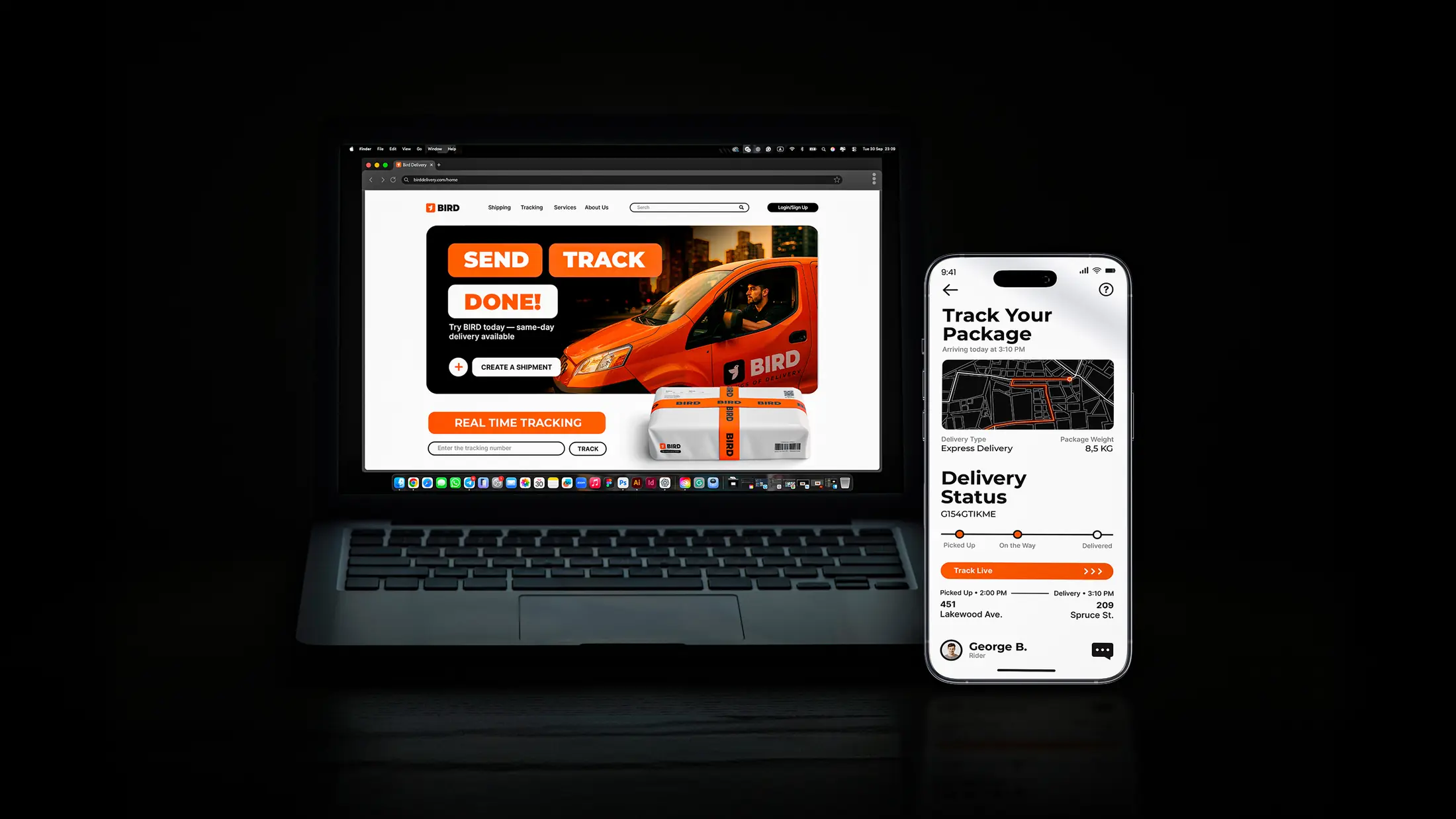
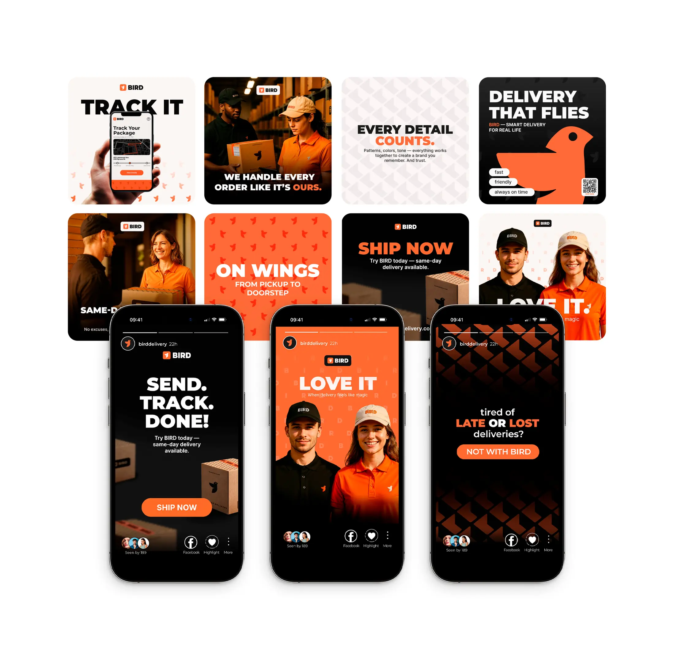
The system carries directly into the product: direct language, recognizable controls and a visual rhythm built around movement.
Built for
real life.
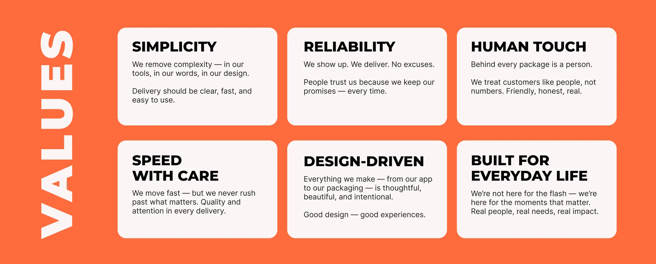
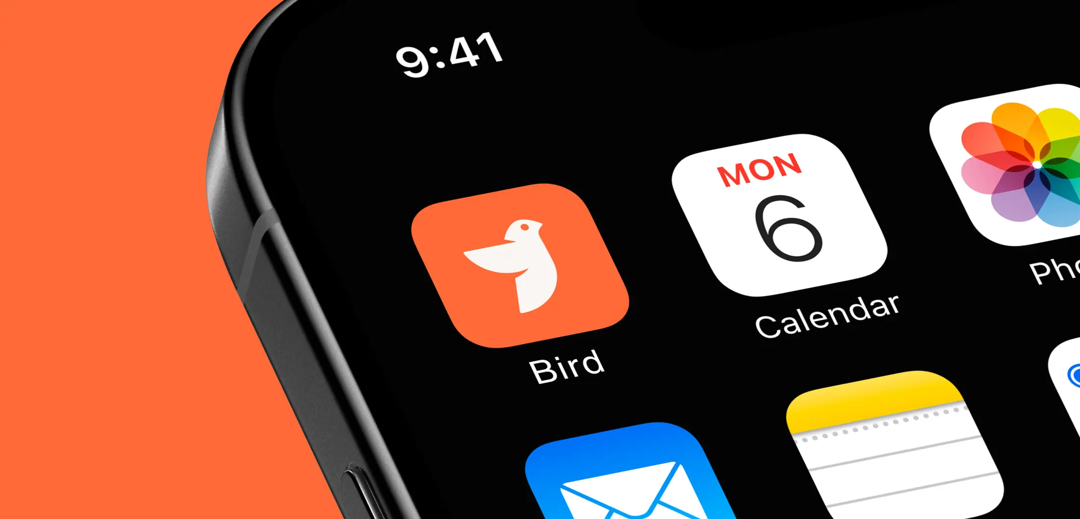
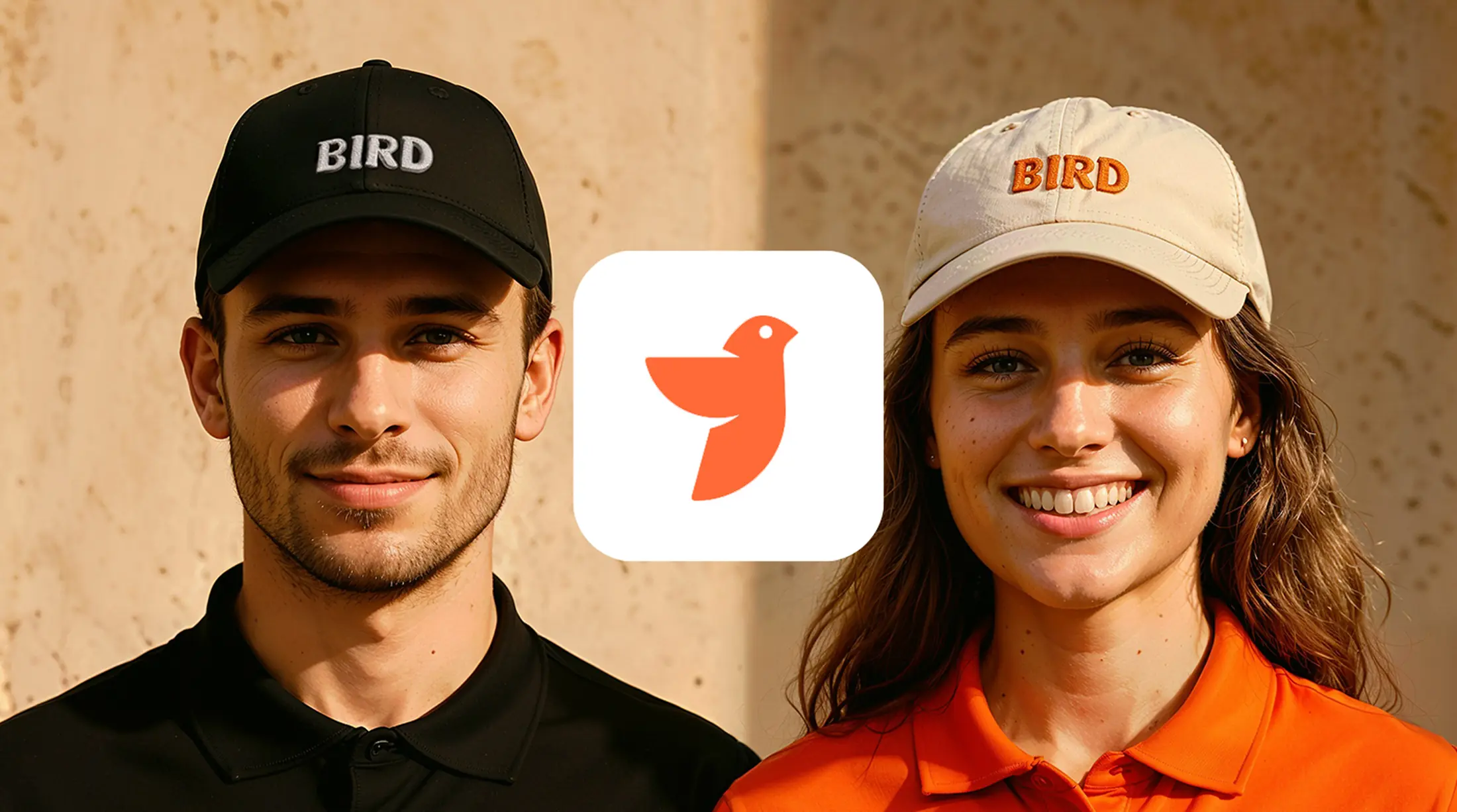
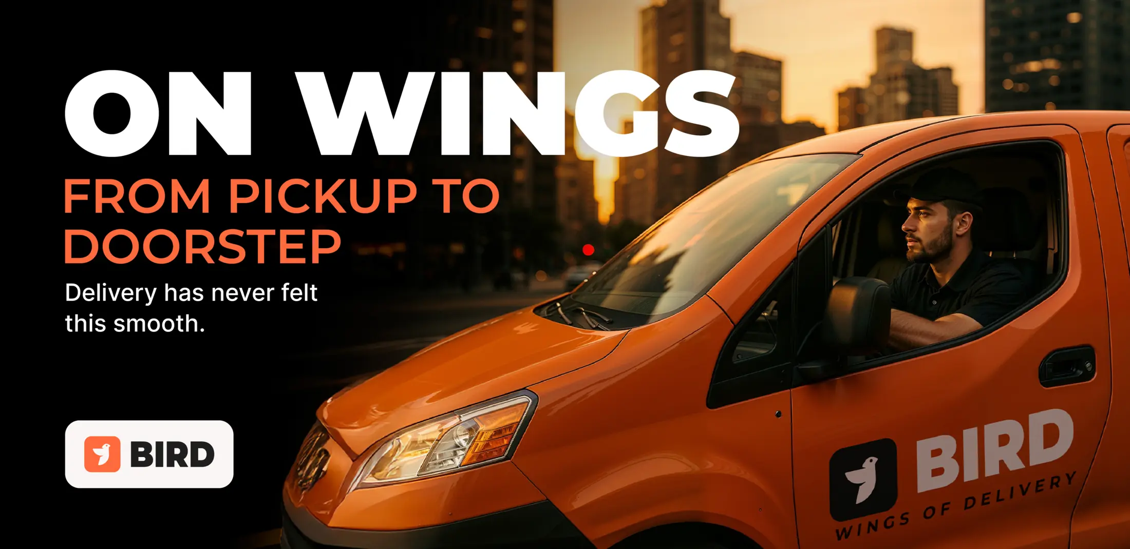
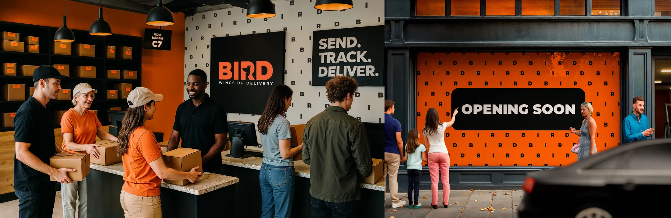
The identity is designed to remain coherent in the places customers actually meet it — from a courier’s uniform to a pickup point, phone screen or campaign.
One system. Every touchpoint.